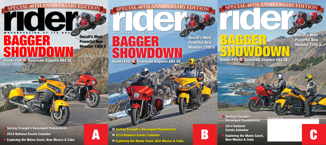
The Rider magazine staff is having fun putting together its 40th Anniversary issue (May 2014). We’ve come up with three different cover ideas. Which one would you be most likely to buy? Vote with A, B or C by commenting below. You can also vote on our Facebook page by clicking HERE and looking for the cover post.


A
C
A
I like B the best because the riders are on the road, in the wind and the scenery is gorgeous. I also like the use of font colors coordinating with the bike colors. Nice presentation.
A. It’s all about the bikes.
A gives best view bikes. that is what I want to see. with riders on board I am looking at their gear, helmets, riding position…
C
B
Cover B gets my vote. It has it all. Actual riders in action, stunning background and setting visuals, along with a slightly angular view.
None of them stand out big time for me initially, until I noticed the small print about Triumphs. Use B, but have the bagger showdown and Ducati all in black print to stand out more. the light blue background tends to hide the white lettering somewhat.
B.
B
B with Rider written in Black. Stands out more.
IMO, C is preferred over B; the horizon line in B is un-natural juxtaposed to the upright positioning of the bikes.
To me, A is also preferable to B
I vote “B”.
C
I vote “B”. The riders being on the road with the fabulous views really gets your imagination going.
I have to say C.
The expansive and dramatic background (in sharp focus) sets the bikes as players in the bigger picture, i.e., the viewer sees the bikes and riders going places, and with all that entails from that process may creatively fill in the blanks with their own imagination.
I don’t see how covers with generic backgrounds, or even duller studio shots, really motivate the viewer (me anyhow) to pick up the magazine off the rack.
To explain, active motorcyclists see their machines as a means to and end – that end being roads, distance, transitions, adventure, etc. In an of themselves, pictorially speaking, the motorcycle does less to stir the soul and imagination than the single subject image would than if they were depicted passing through or towards an iconic or otherwise compelling setting.
Mad Men era advertisers seemed to have firmly grasped this concept of pairing product and utilization/setting as inclusive and complementary, as evidenced by that same imagery commonly depicted in vintage auto and RV advertising.
Sorry, I didn’t mean to ramble and pontificate about this…it just happened. Anyhow, “C” looks nicest.
“C”
Bikes, Riders, Gear, Scenery (1000 words)
‘A’ gets my vote. It shows the bikes the best. (In my humble opinion !!)
‘C’ because it looks like the Ducati is about to crush the two baggers!